LOGO DESIGN
DEVELOPING A BRAND
There are many things that have to be considered and implemented in order for a logo to make sense, catch the attention of an ideal audience, and set it apart.
To help you decide what kind of logo works for you, consider these factors.
EVOLUTION OF A LOGO
ORIGINAL LOGO

COLOUR ADDED
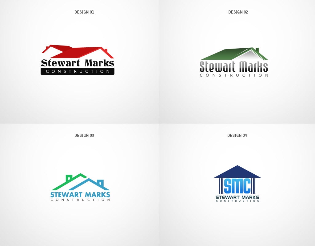
NEW CONCEPTS
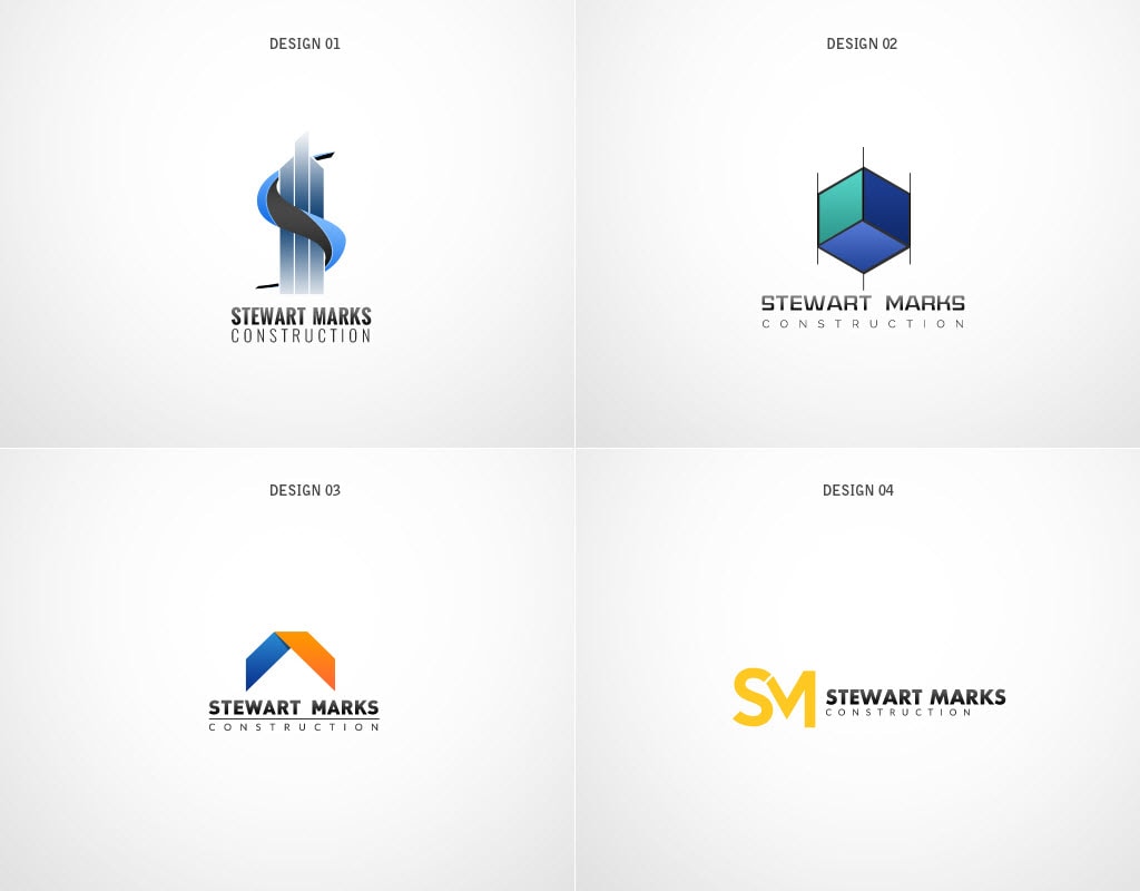
CONCEPT FOCUS
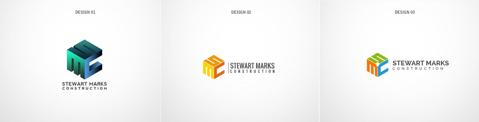
COLOURS TESTED
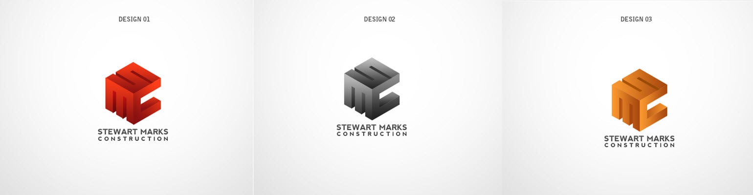
FINAL LOGO

DOs
Keep It Simple S…
Efforts to create something original and creative can often result in making things more complicated than they need to be. The best logos are simple. This doesn’t mean that the designers behind them sacrificed creativity, but they didn’t add a million bells and whistles, either. A common design rule of thumb is to highlight one feature in a logo. Just one. Keep it simple!
DON’Ts
They focus on one key feature. The more you add onto the design of your logo, the higher the chance is that it will be confusing for your audience.
Keep It Simple Smarty!
Trends come and go… if you follow everyone else, you’ll end up continually following with every new trend and replacing your logo when it becomes outdated in a few years.
Strong brands are consistent. They do not flip flop from one design to the next. How many times has McDonalds changed their logo?
If you want to create recognition with your audience, be consistent. Consistency has always been the fastest way to develop trust.
Not only is this plagiarism (and possibly a copyright violation), but it can be detrimental to your brand.
One of the largest benefits of branding is the ability to set yourself, your business, or your blog apart from everything else that’s already out there. By imitating someone else’s logo, you’re stealing their creativity and robbing yourself of yours.
A good rule of thumb is to keep the fonts to two or less. The use of several fonts has the potential to result in a logo that isn’t cohesive and ugly.